
Jim Pitiranggon
Data Analyst | SQL | Excel | Tableau
About Me
Welcome to my portfolio!
My name is Jim Pitiranggon and I'm a Data Analyst.I have a passion for data and creating meaningful visualizations to help businesses make informed-decisions based on data-driven insights.I am constantly working to improve my craft and grow as a professional. I strongly believe there's always room for growth.Thanks for taking the time to visit!
Skills

SQL - Joins, Subqueries, Window Functions, Common Table Expressions
Excel - Pivot Tables, XLOOKUP, VLOOKUP, Visualizations, Dashboards
Tableau - KPI Dashboards, Visualizations, Interactive Functionality
Project Management
Communication Skills
Presentation Skills
Leadership
Adaptability
Fast-Learner
Growth Mindset
Projects
Tableau
British Airways Review Interactive Dashboard
IInteractive Dashboard on British Airways reviews.


SQL
World Life Expectancy
Data Cleaning and Exploratory Data Analysis completed on world life expectancy data utilizing SQL. Information presented in interactive Tableau dashboard.
Excel
COFFEE SALES DASHBOARD
Coffee Shop Sales metrics and key performance indicators interactive dashboard created with Excel.

Tableau
Call Center KPI
Dashboard

In this project, I utilized Tableau to create an interactive dashboard on British Airways reviews based on various metrics. The dashboard allows the user to filter review scores by a range of metrics, including overall review, cabin staff, in-flight entertainment, and more.Questions I was interested in answering:
1. How do reviews compare based on what country passengers are traveling from?
2. Are passengers having a significantly different experience based on their seat type (first class, economy class, etc.)?
3. Does the time of year contribute to higher or lower ratings?My analysis consisted of:
1. Pulling data from GitHub, cleaning it, and preparing it for analysis.
2. Creating a parameter to allow interactive filtering by various metrics.
3. Utilizing case statements within a calculated field to employ the interactive element of the dashboard.
4. Creating strategic charts to effectively display important information, and aggregating data to calculate specific key performance indicators.
5. Formatting the dashboard to create a cohesive, functional tool.Dashboard Breakdown:
- Core KPI's are easily visible at the top of the dashboard and change based on selected filter.
- Range of filters that can be quickly applied are listed on the left side of the dashboard.
- Line graph displaying ratings by month over the course of several years.
- Geographic map that breaks down ratings by country.
- Bar graph to display average ratings by aircraft type, along with the number of reviews left for each aircraft type.Thank you for taking time to visit my portfolio! If you'd like to see more Tableau projects I've completed, please click below.
SQL
World Life Expectancy
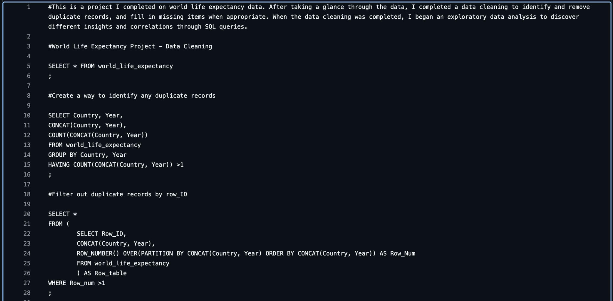
In this project, I utilized SQL to extract, transform, and load a World Life Expectancy dataset. The process required removing duplicate records, updating missing information in the dataset, and running queries to analyze the data.Questions I was interested in answering:
1. What was the lowest and highest life expectancy for each country in the last 15 years?
2. Is there a correlation between GDP and life expectancy?
3. Is there a correlation between BMI and life expectancy?My analysis consisted of:
1. Identifying and removing duplicate records.
2. Filling missing fields with appropriate data where possible.
3. Running queries to answer questions and identify information.
4. Utilizing case statements to categorize data.


Key Takeaways:
- There is a high correlation between GDP and life expectancy.
- Countries with a high GDP consistently had a significantly higher life expectancy than those with a lower GDP.
- Shockingly, there was a low correlation between BMI and life expectancy. Countries with higher life expectancies consistently had much higher BMIs in the obese range according to the CDC.
- Life expectancies increased for all countries over the span of the last 15 years. This is likely due to the advancement of modern medicine and a growing GDP.Thank you for taking the time to visit my portfolio! If you would like to see more SQL code I've written, please click below to visit my GitHub.
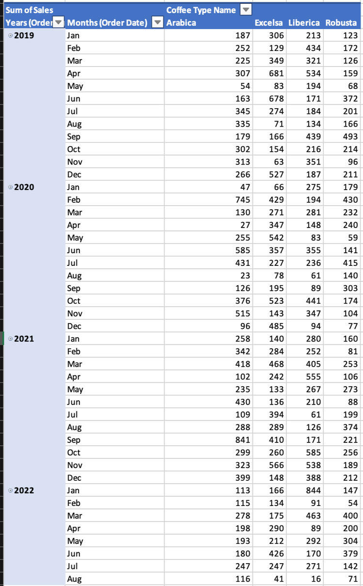
Excel
COFFEE SALES DASHBOARD
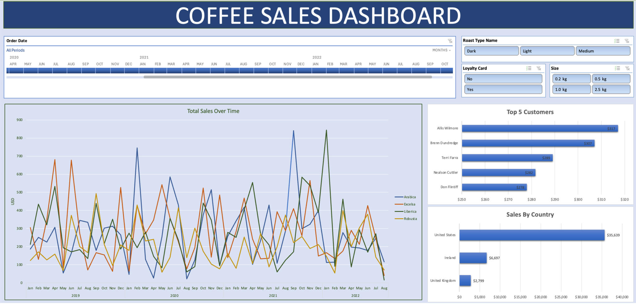
In this project, I utilized Excel to create a dynamic, interactive dashboard detailing key performance indicators for sales at a coffee shop. The dashboard includes an interactive timeline, charts, and dynamic slicers to manipulate the dashboard.Questions I was interested in answering:
1. What do total sales for different types of coffee look like for the shop?
2. Which customers spend the most money on purchases at the shop?
3. Is the shop's loyalty card popular among customers?My analysis consisted of:
1. Utilizing XLOOKUP and INDEX MATCH to fill in missing customer and product information from multiple sheets.
2. Creating Pivot Tables and Pivot Charts to display the data.
3. Adding an interactive timeline to allow specified date functionality to the charts.
4. Adding dynamic slicers to filter visuals based on product information.
Dashboard Breakdown:
- Line graph displaying total sales of different coffee types.
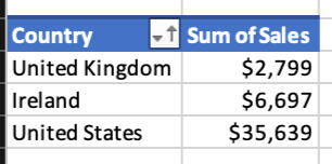
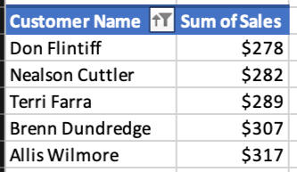
- Bar charts showing top 5 customers in spending and the total amount spent for each customer, and sales by country including the total amount sold for each country.
-Interactive timeline at the top displays data for specified months.
-Slicers in the top right filter visualizations on Roast Type, purchased with a Loyalty Card, and Size of Coffee Bag.Thank you for taking the time to visit my portfolio! If you'd like to interact with this dashboard, please click below to download the file.
Must download as an Excel file!